Sensorial
A brand designed to make time slow down.
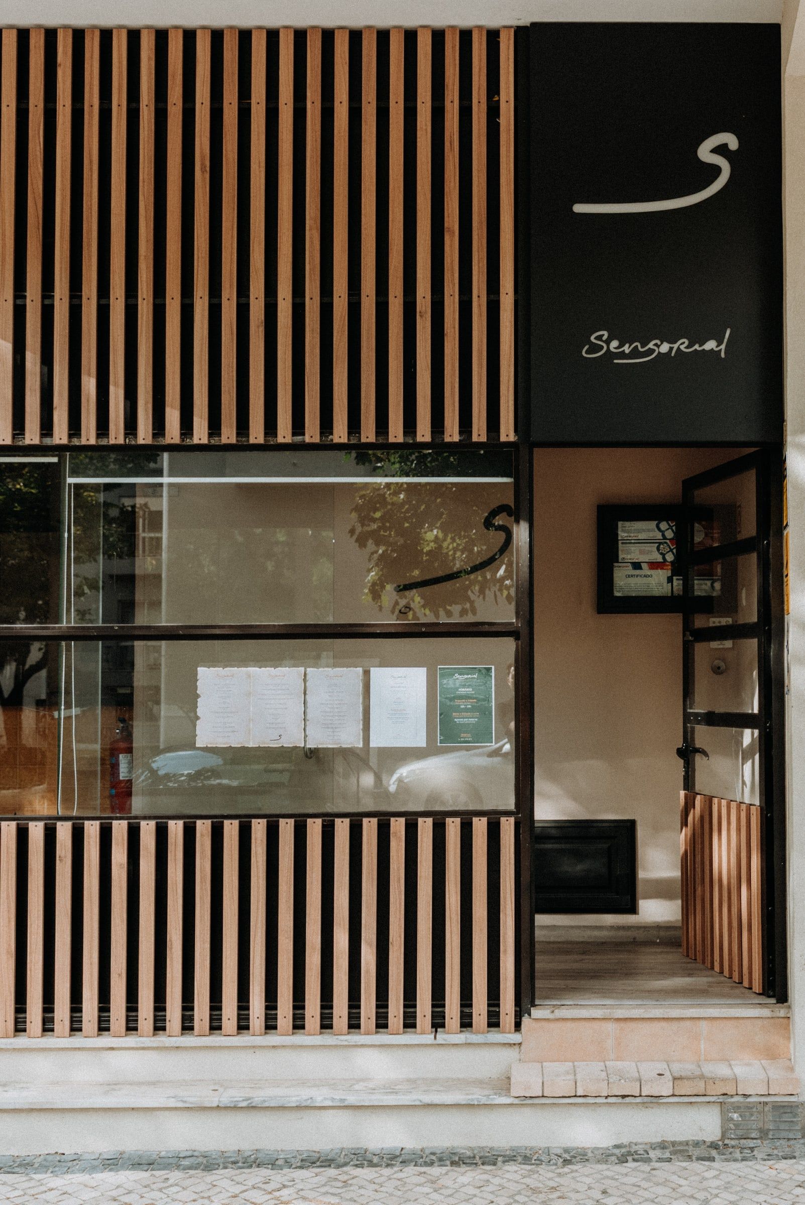
“Who do you want to be in the memory of those who visit you?”
01 Context
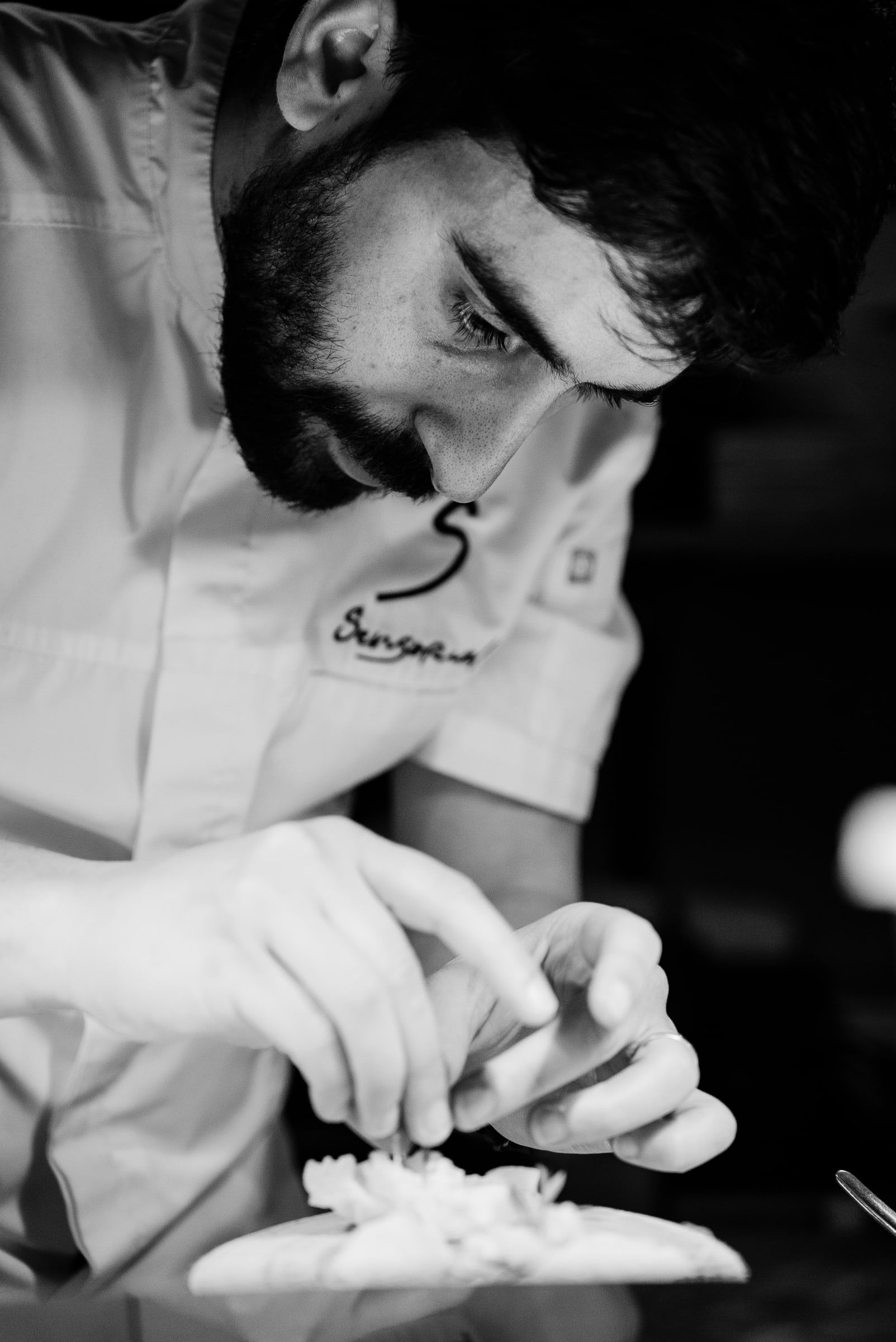
Three brothers, Gerson, Leandro and Vasco Oliveira, wanted to open a restaurant in Aveiro. Gerson, the chef, had one clear idea. He did not want to open just another one.
The city was full of restaurants built to turn tables. They served well and fast. What they lacked was time, intention and emotion.
02 Challenge
The challenge was not to draw a beautiful logo. It was to translate an experience made of time, memory and surprise into a coherent, credible visual language, with a significant investment and a respected chef's name at stake.
03 Idea
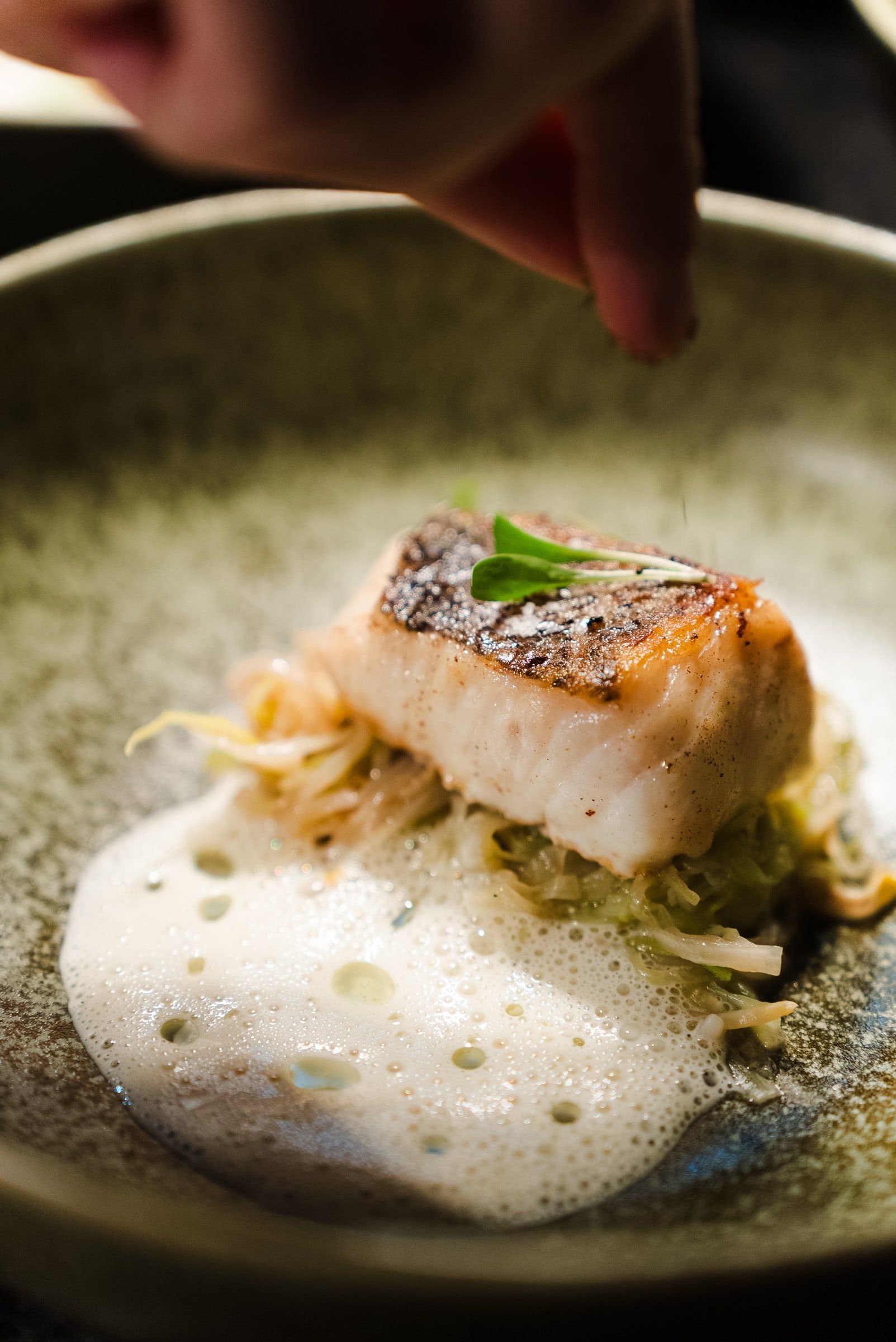
The strategy took the brand to the five senses and to the memory of unhurried cooking, the way it was done at our grandparents' table. A contemporary luxury, quiet and deeply human.
The identity was conceived to support the experience, never to steal it. Restrained, elegant and minimal. Anything loud was left out.
04 System
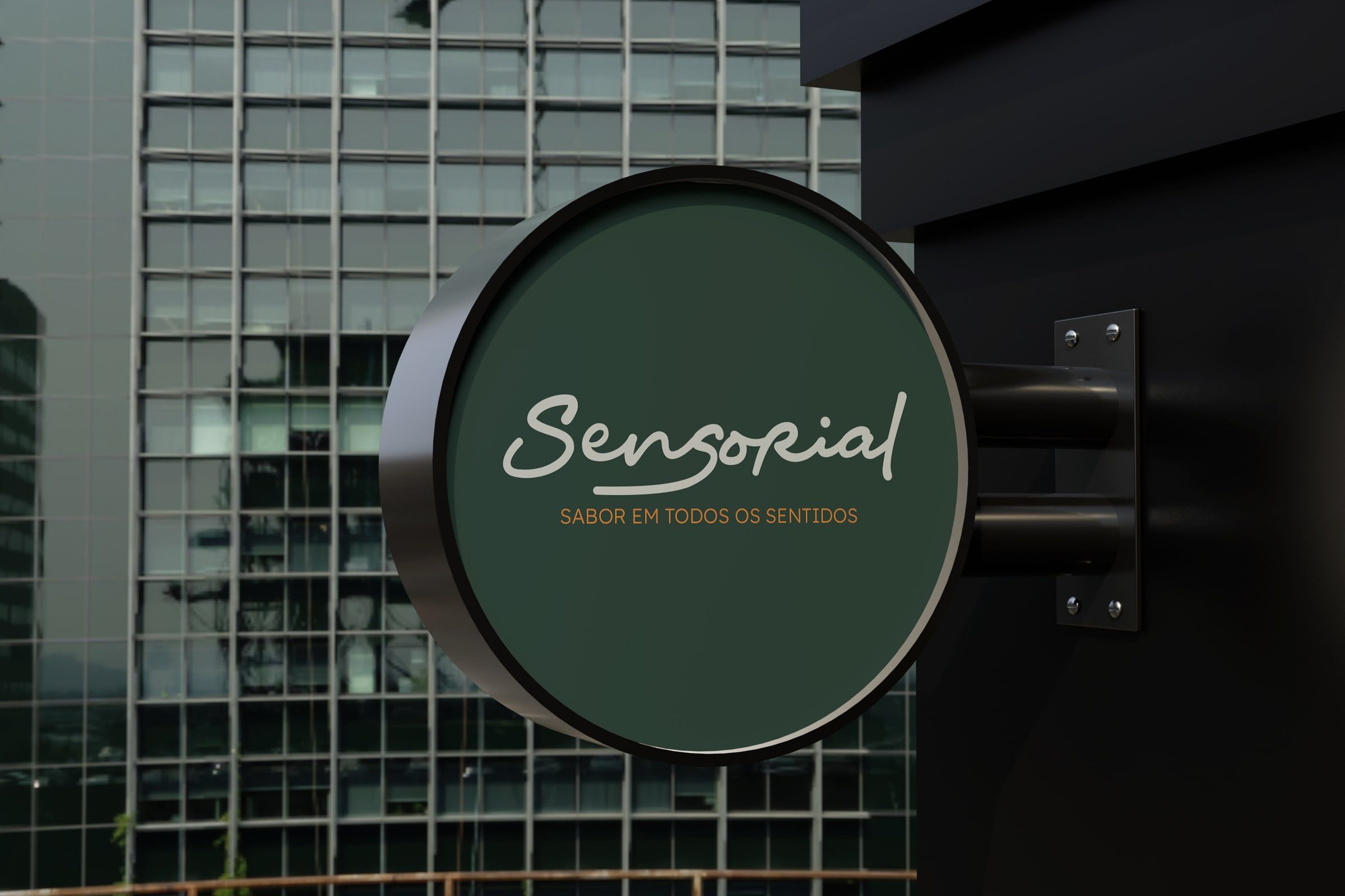
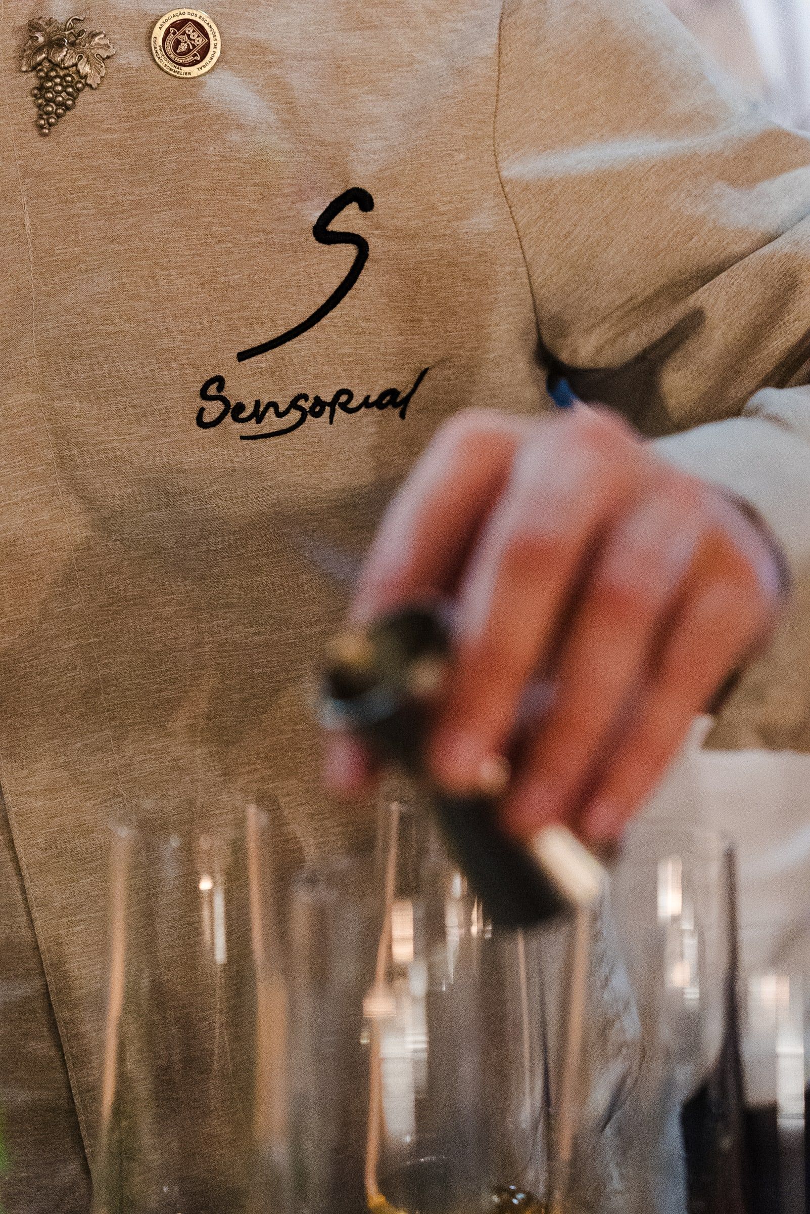
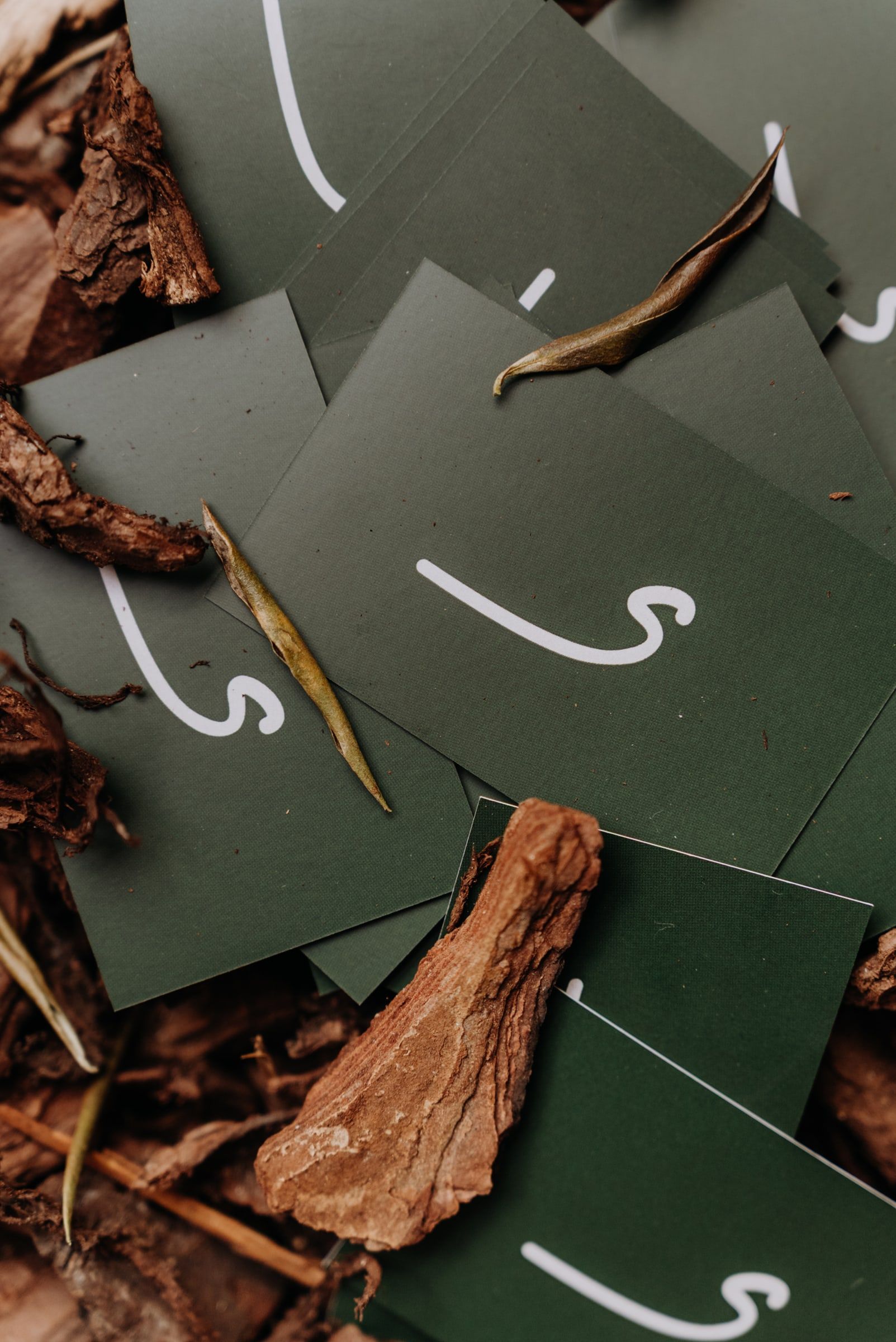
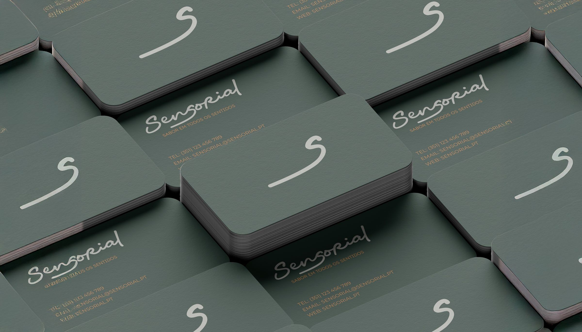
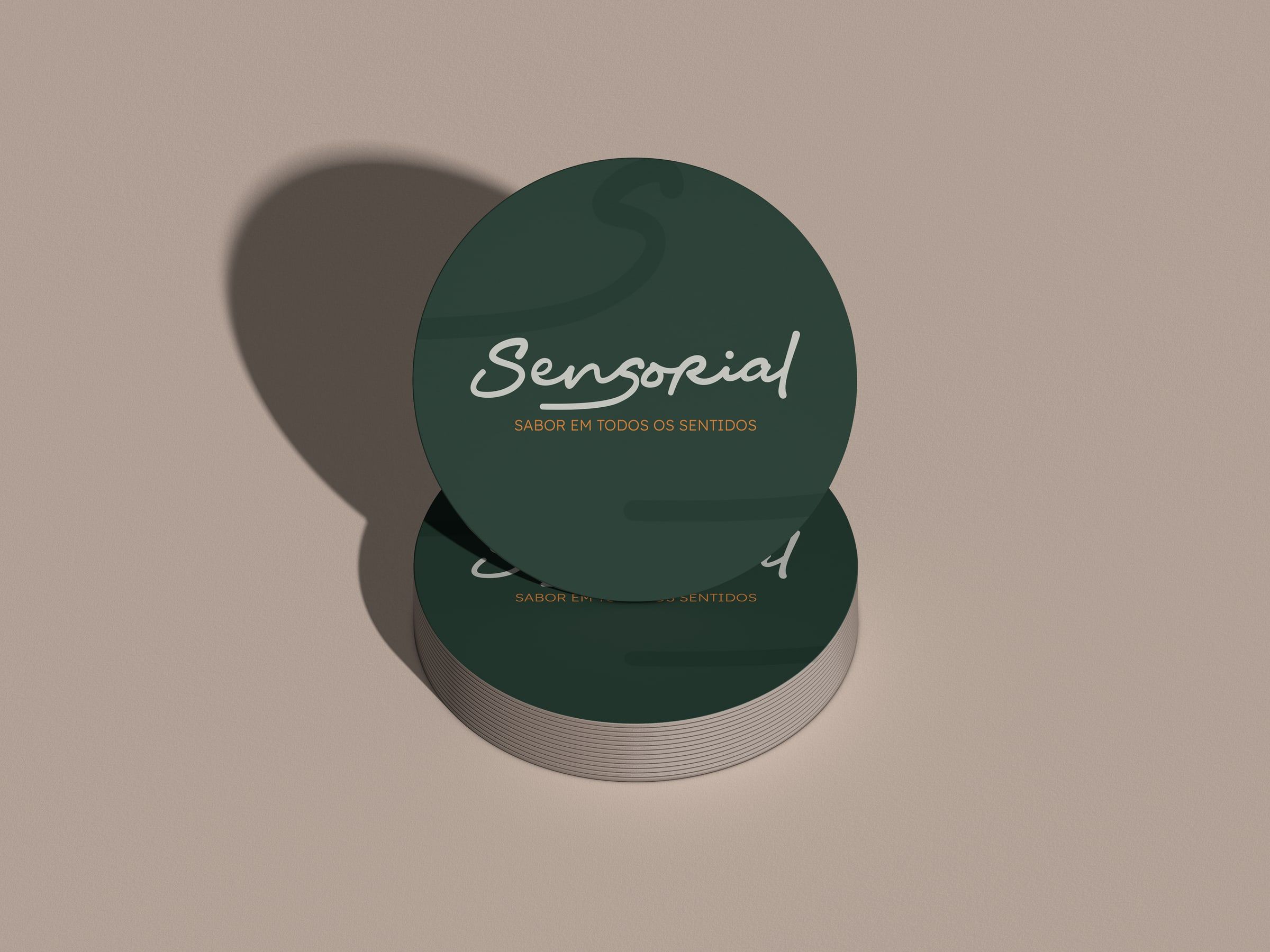
The S was drawn from the shape of the lips, a subtle sign that speaks directly to the senses. The tagline, “Sabor em todos os sentidos” (flavour in every sense), closes the idea.
The palette brings together bottle green, for sophistication and nature, copper, for warm, crafted elegance, nickel grey and shark black.


05 Outcome
The restaurant opened in May 2025. Five months later it was one of the five most sought-after in Aveiro and had entered TheFork's Top 100.
It was planned for business lunches, afternoon tapas and wine, and tasting menus at weekends. People came for the experience. Today it serves tasting menus only.
- Top 5most sought-after restaurants in Aveiro, five months after opening
- Top 100TheFork