ADN Campeões
A shielded identity for those who train the minds of champions.
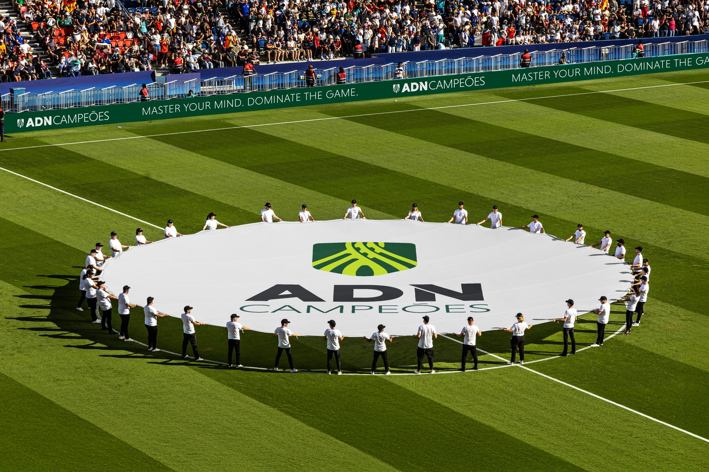
“Why do clubs with similar players achieve completely different results?”
01 Context
ADN Campeões is a high-performance academy for sports clubs, led by Ricardo Mendoza. It works where technique and tactics are no longer enough, on a club's mindset, leadership, communication and culture.
02 Challenge
A full rebrand. To redefine the positioning, tone of voice and communication of a demanding methodology that brings together neuro-strategy, emotional intelligence, coaching and neuro-linguistic programming, and give it a visual form as solid on the pitch as in a boardroom.
03 Idea
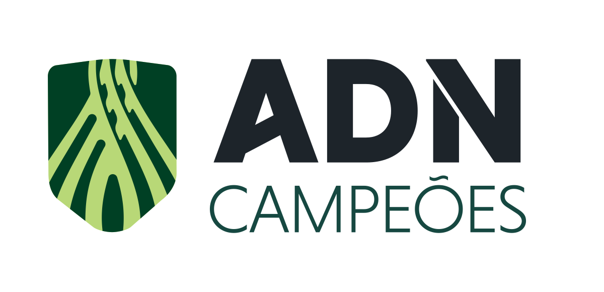
In high performance, an athlete's greatest threat is not the opponent. It is pressure, noise and anxiety. The symbol brings three ideas together.
The shield, for defence and resilience. The fibres, the muscles rebuilt by thousands of hours of training and the neural pathways of mental reprogramming. The Gordian knot, clarity under pressure, with lines that cut through confusion and limiting beliefs.
04 System
A palette of focus and authority, with deep greens, graphite and an energising lime. A geometric typeface with exact proportions, expressing the method and logic of the Sage archetype.
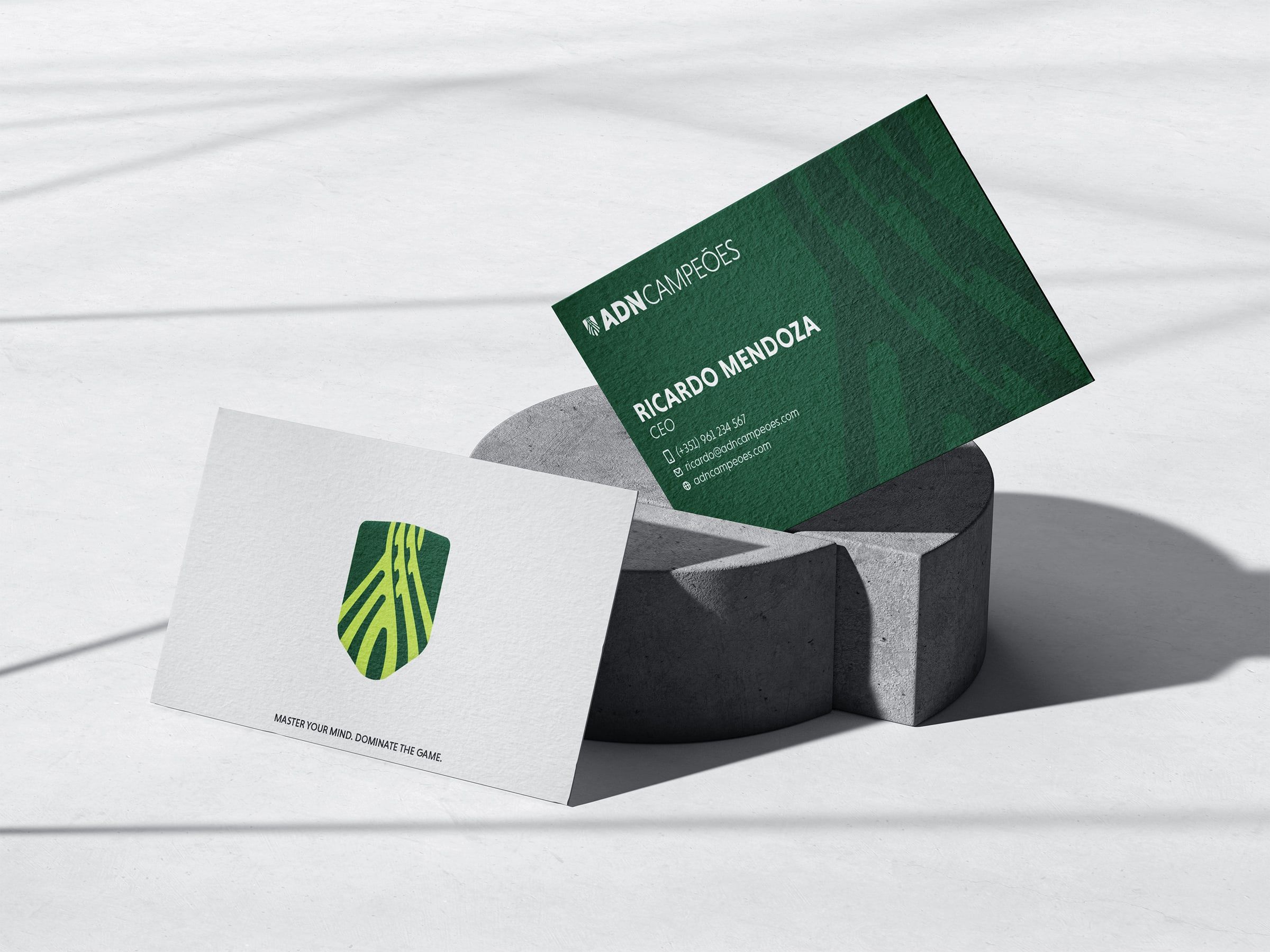
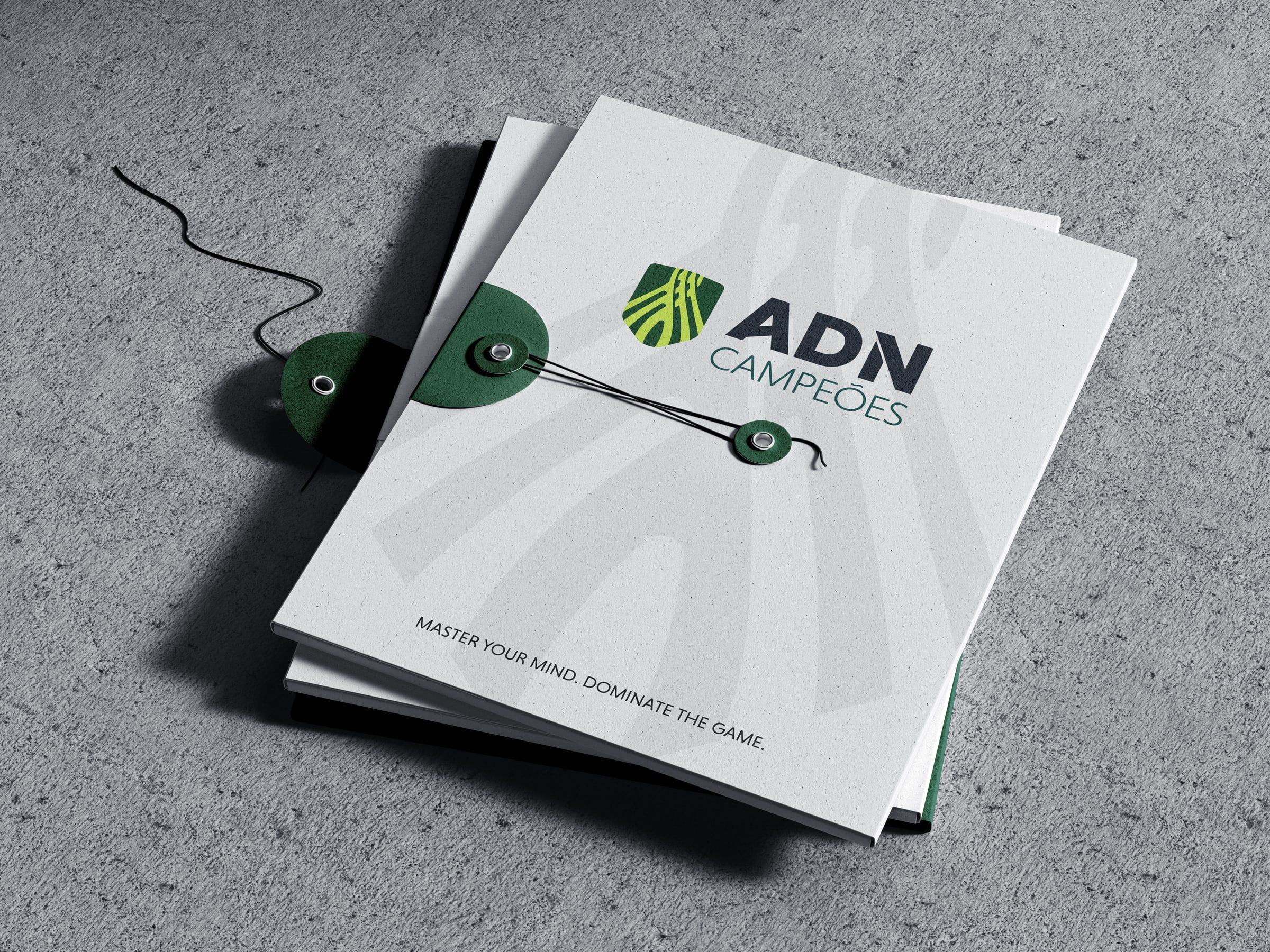
Primary logo, horizontal and vertical versions, symbol, pattern and usage rules, gathered in the brand guidelines and applied in the institutional dossier.

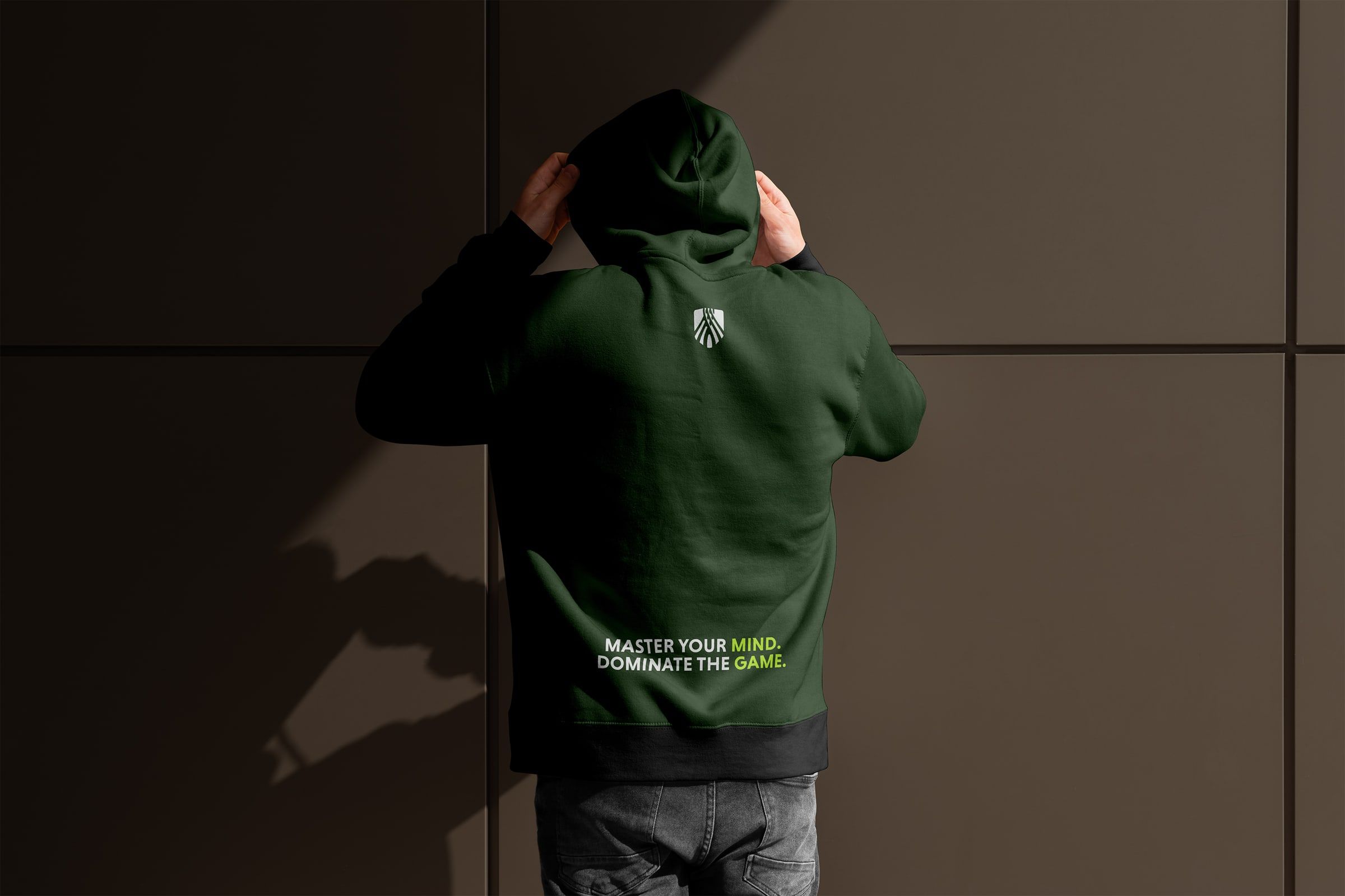
05 Outcome
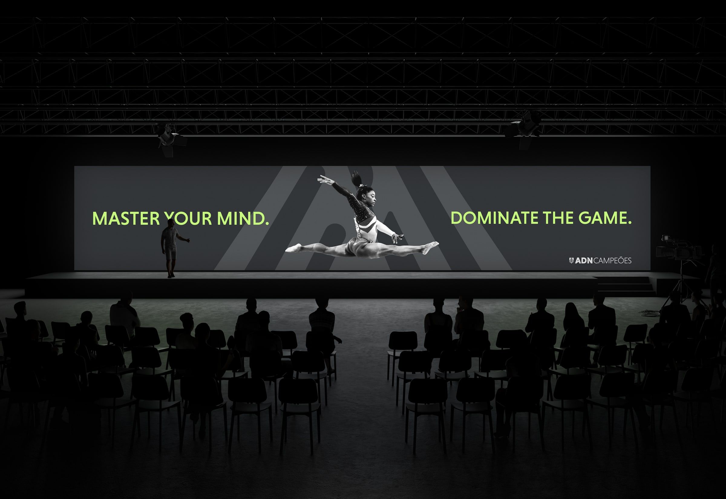
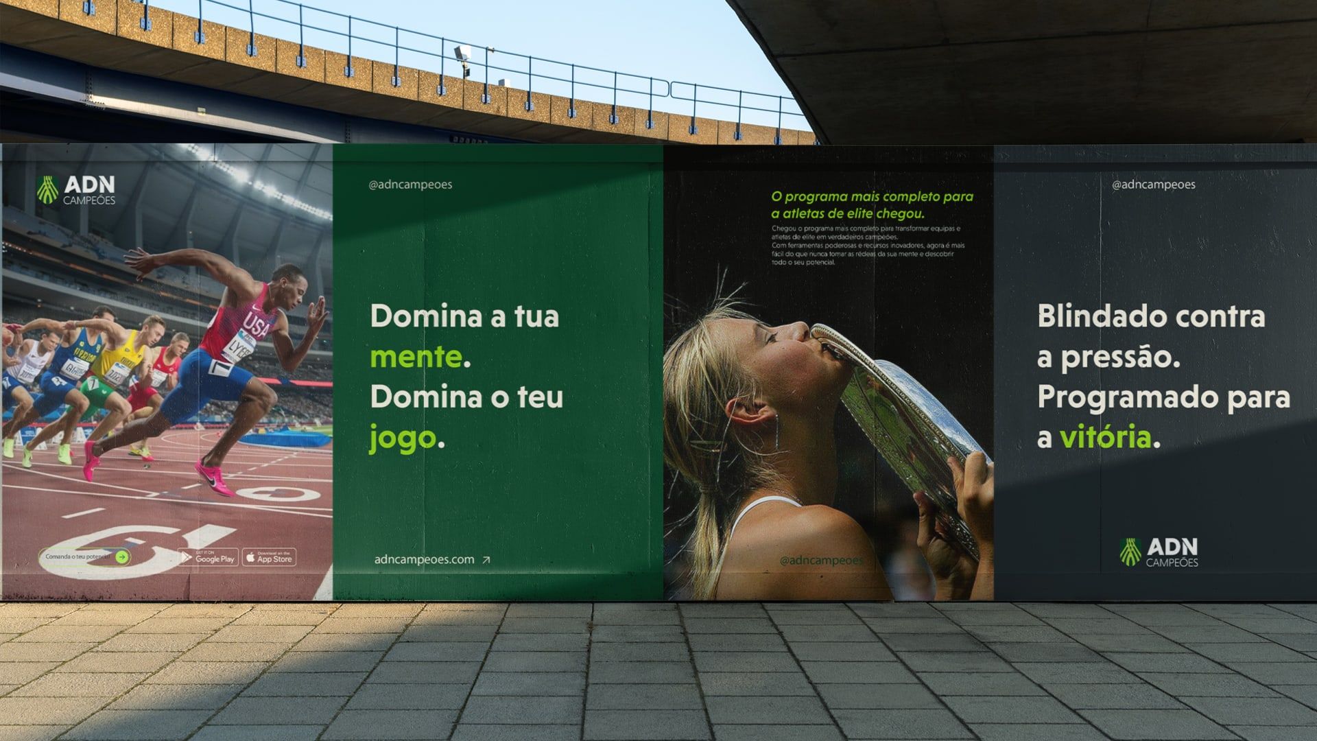
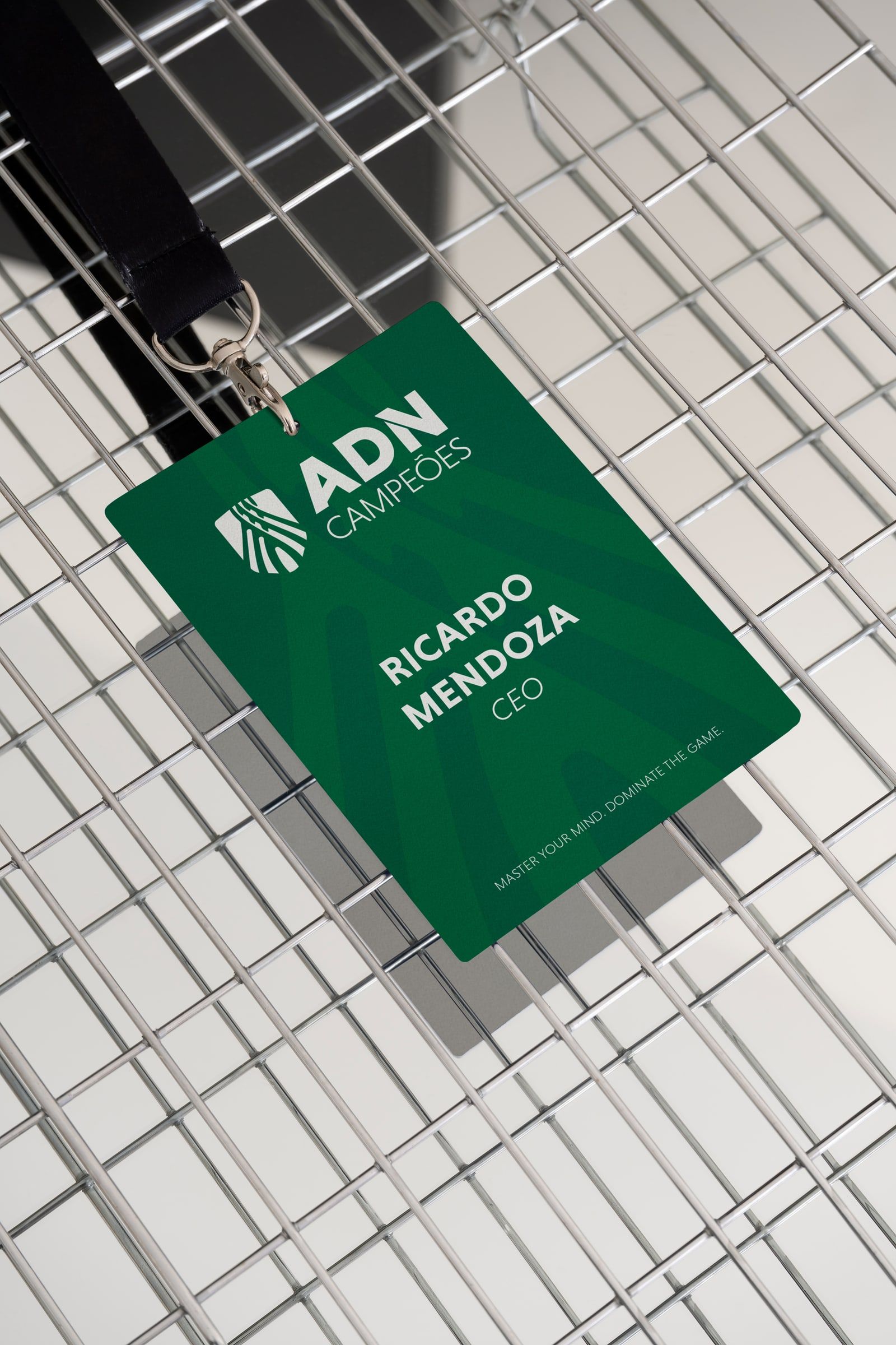
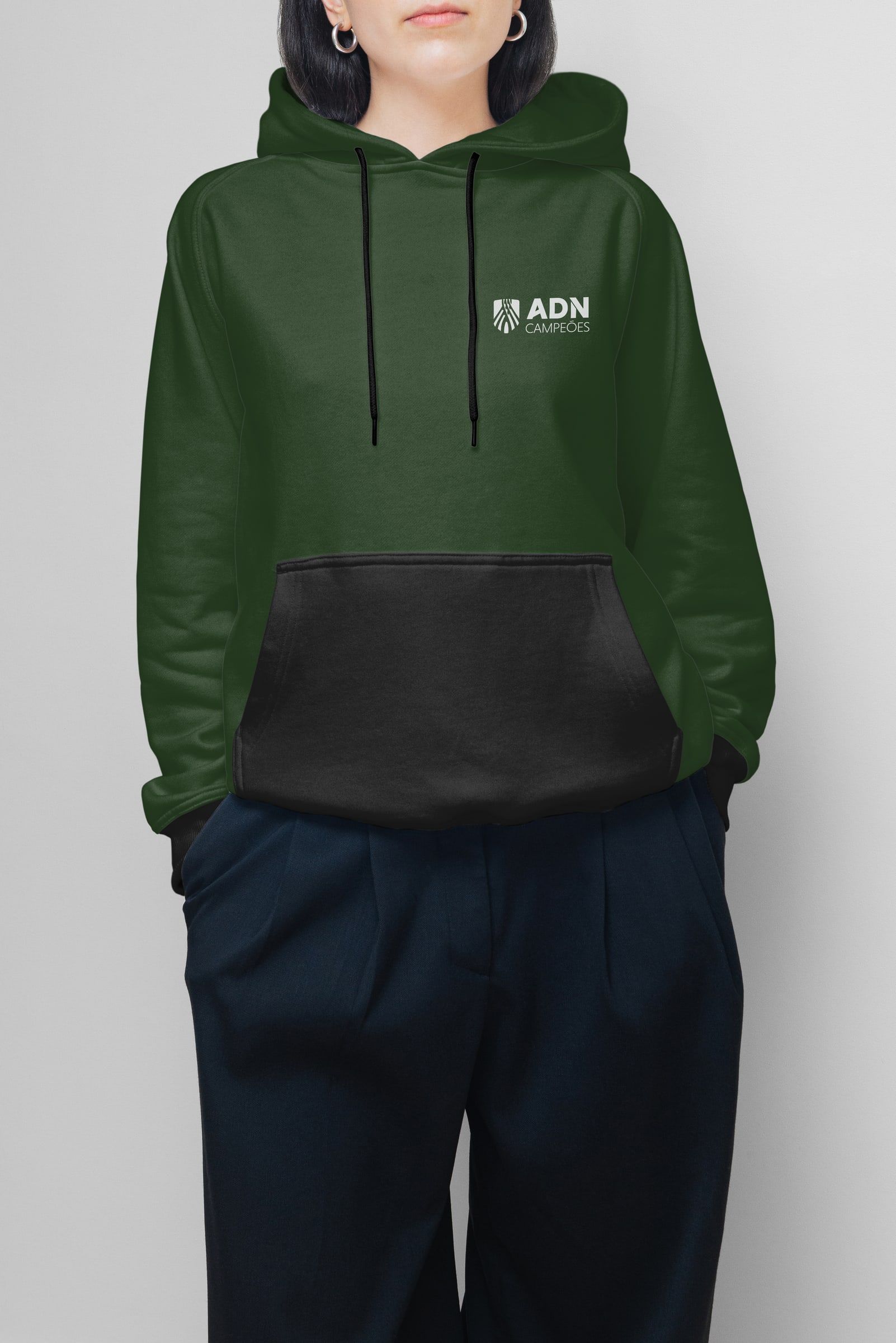
A system ready to live on the pitch, on stage and on paper. From training kit to auditorium screen, the brand always speaks with the same voice. Master your mind. Dominate the game.